Navigation and Page Headers
Lay out a desktop app's menu as a top bar or a sidebar, style the frame around its views, control the menu from scripts, and give each view a page header
Navigation and Page Headers Guide
Every desktop user interface has a frame around its views: the menu, the header with the logo and the user menu, and the page itself. This guide covers how to shape that frame — where the menu goes, how the header looks — and how to give each view a page header with a title, badges and buttons of its own.
All of it is set per user interface in the builder, and two script APIs let you change it while the app runs:
| What | Where in the builder | From a script |
|---|---|---|
| Menu layout, items, header search, user menu | User interface → Navigation tab | context.getNavigation() |
| Header and page look | User interface → Frame tab | — |
| A view's page header | View → Header tab | context.setPageHeader() |
These are desktop features. Mobile user interfaces keep their own navigation.
Existing apps don't change. An interface with no navigation settings keeps the classic top navbar, and a view with no page header shows none. Nothing here takes effect until you choose it.
Navigation Layouts
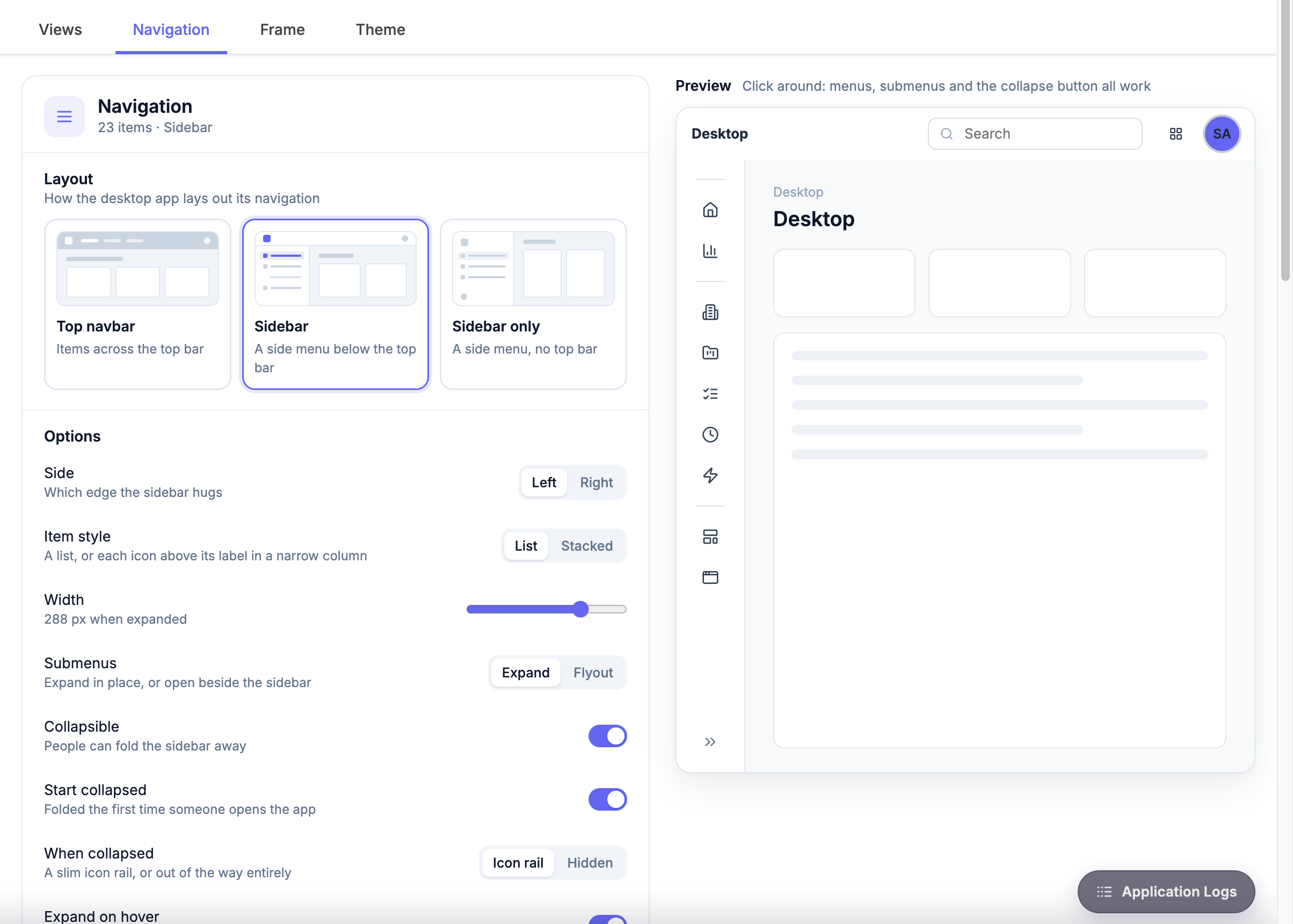
Open the user interface in the builder and choose the Navigation tab. Layout decides where the menu lives:
| Layout | What you get |
|---|---|
| Top navbar | The menu runs across the top bar. The classic Appivo layout, and the default. |
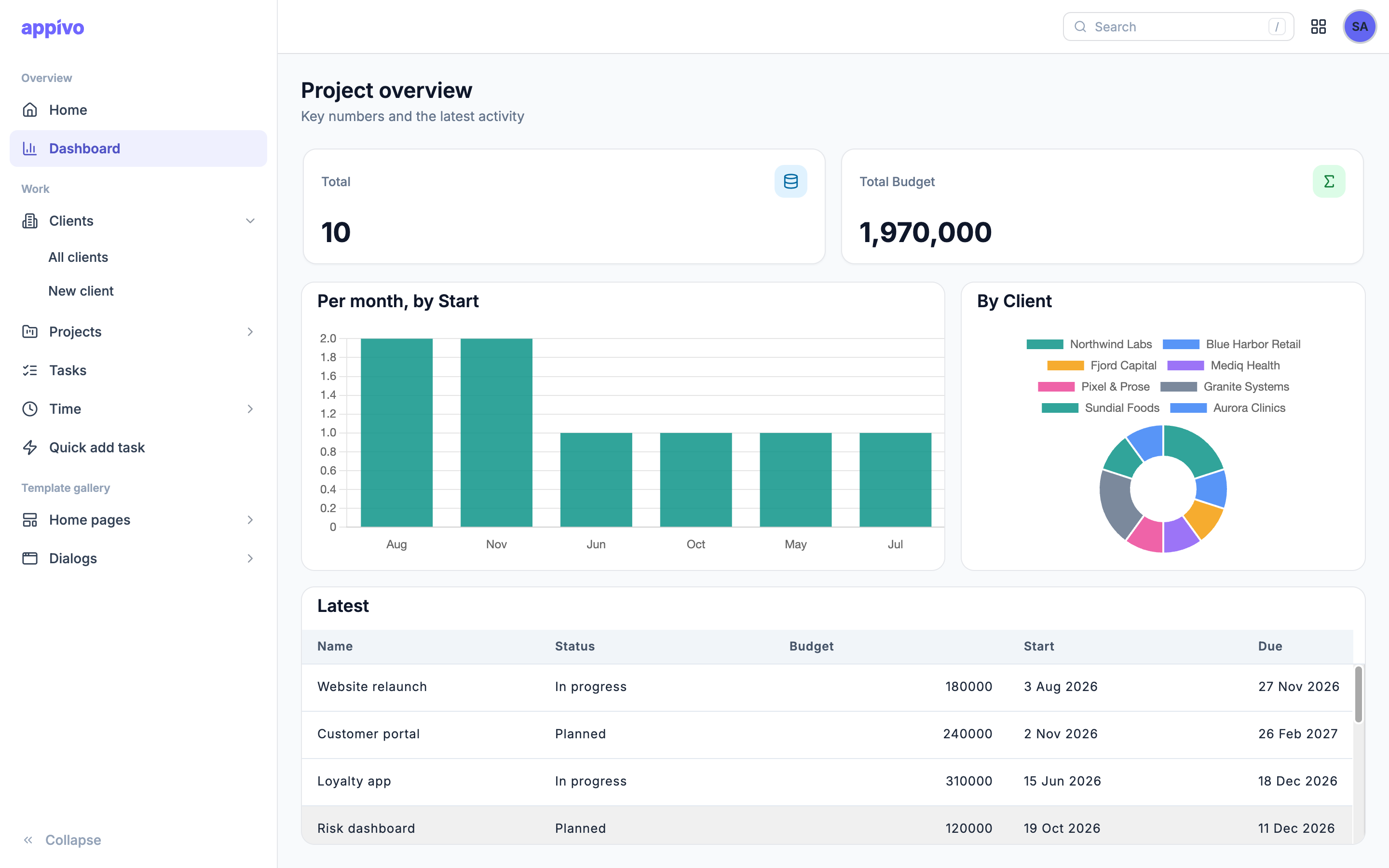
| Sidebar | A side menu below the top bar. The top bar keeps the logo, search and user menu. |
| Sidebar only | A side menu and no top bar. The logo, search and user menu move into the sidebar. |
The preview on the tab is live: menus, submenus and the collapse button all work, so try the options there before saving.
Top Navbar Options
| Option | What it does |
|---|---|
| Alignment | Left, center or right: where the items sit in the header |
| Open submenus on | Hover or click |
| Show icons | An icon before each top-level item |
Sidebar Options
| Option | What it does |
|---|---|
| Side | Which edge the sidebar hugs |
| Width | The width when expanded |
| Item style | List, or Stacked: each icon above its label in a narrow column |
| Submenus | Expand in place, or open as a Flyout beside the sidebar |
| Collapsible | People can fold the sidebar away |
| Start collapsed | Folded the first time someone opens the app (after that, each person's choice is remembered) |
| When collapsed | A slim Icon rail, or Hidden entirely |
| Expand on hover | The collapsed icon rail slides out over the page while the pointer is on it |
| Section headings | Show heading items as group labels |
Header Options
| Option | What it does |
|---|---|
| Search | A search box that finds pages, and anything else you add as a search source |
| User menu | The avatar menu with the user's name and Logout |
| Appivo links | My apps, profile and account pages in the user menu |
| User menu position | In the header, or at the bottom of the sidebar |
| Bottom of the sidebar | Which comes last: the Collapse button or the user menu |
Menu Items
The Items list on the Navigation tab is the menu itself. There are three kinds of entry:
- Item — opens a view, or runs a script when clicked. Give it an icon; in the sidebar it is what shows on the collapsed rail.
- Submenu — a group of items. Starts open expands it when the app opens.
- Heading — a label that groups the items after it. Headings only show in the sidebar layouts.
An item can still only be seen by users who may open its view: an entry for a view the user lacks the privileges or features for is left out of the menu automatically.
Items That Run a Script
Set an item's When clicked to Run a script to run your own code instead of opening a view. The script runs in the user interface's common view, gets context like any action script, and args.item with the entry's id and label. It may be async.
// Runs when this entry is clicked. args.item is { id, label }.
const open = await context.queryForArray('OpenOrders', {}, 0, 1);
if (open.length) {
    context.setView('OrderView', open[0]);
} else {
    context.setView('Orders');
}
Header Search
Turn on Search in the Navigation tab to put a search box in the header. Pressing / anywhere in the app puts the cursor in it.
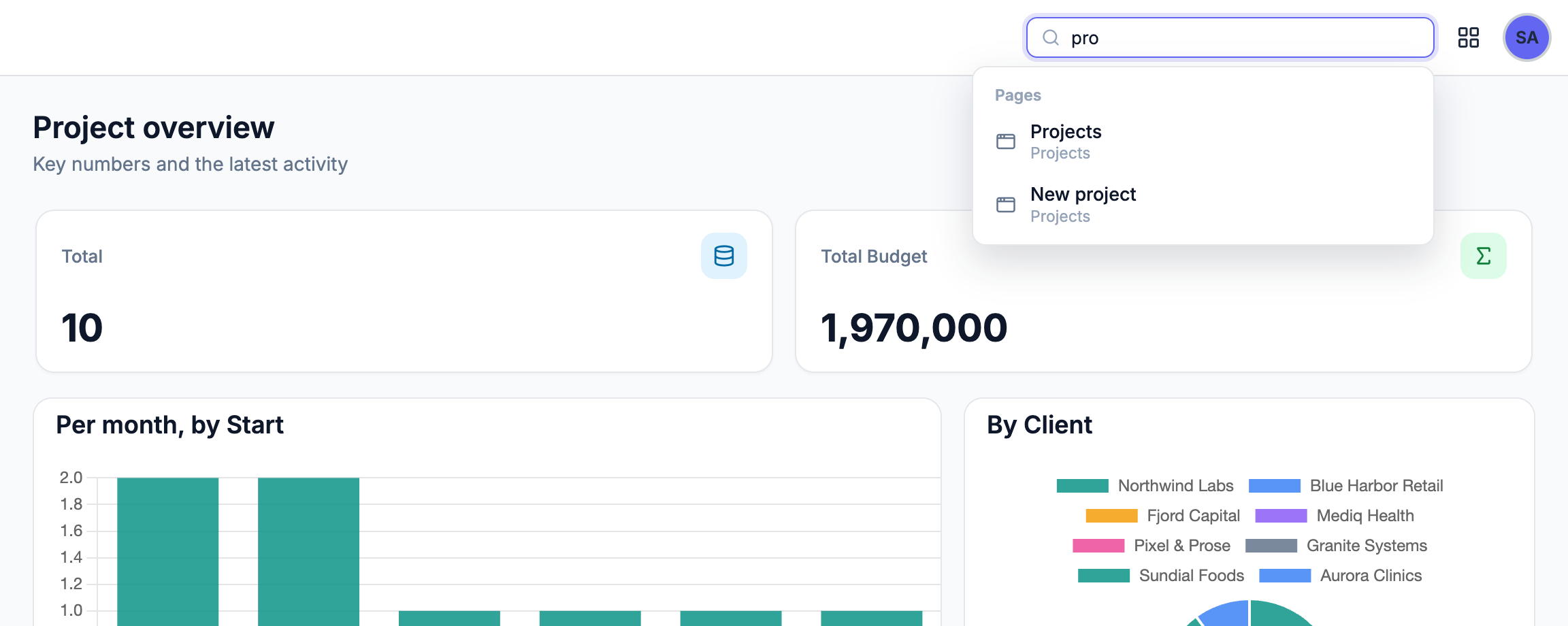
What it searches is set under Search sources, in order:
- Pages (built in) — every page the signed-in user may open, matched on its title. Pages they lack the privileges or features for are left out.
- Function sources — a function of the user interface's common view. It gets the typed text as
args.termand returns the results, or a Promise of them. Each result shows in its own group, under the group title you give the source, as soon as its function answers.
A result is an object with a title (or label), and optionally a subtitle, an icon class, and the view and id to open when it is picked:
// A common-view function used as a search source
const rows = await context.queryForArray('Customers', { name: args.term }, 0, 5);
return rows.map(c => ({
    title: c.Name,
    subtitle: c.City,
    icon: 'lucide lucide-building-2',
    view: 'CustomerView',
    id: c.id
}));
Max results limits how many results a source shows.
The Frame Tab
The Frame tab styles everything around the views: the header, the sidebar and the page. The preview shows your interface's own menu and an example page header.
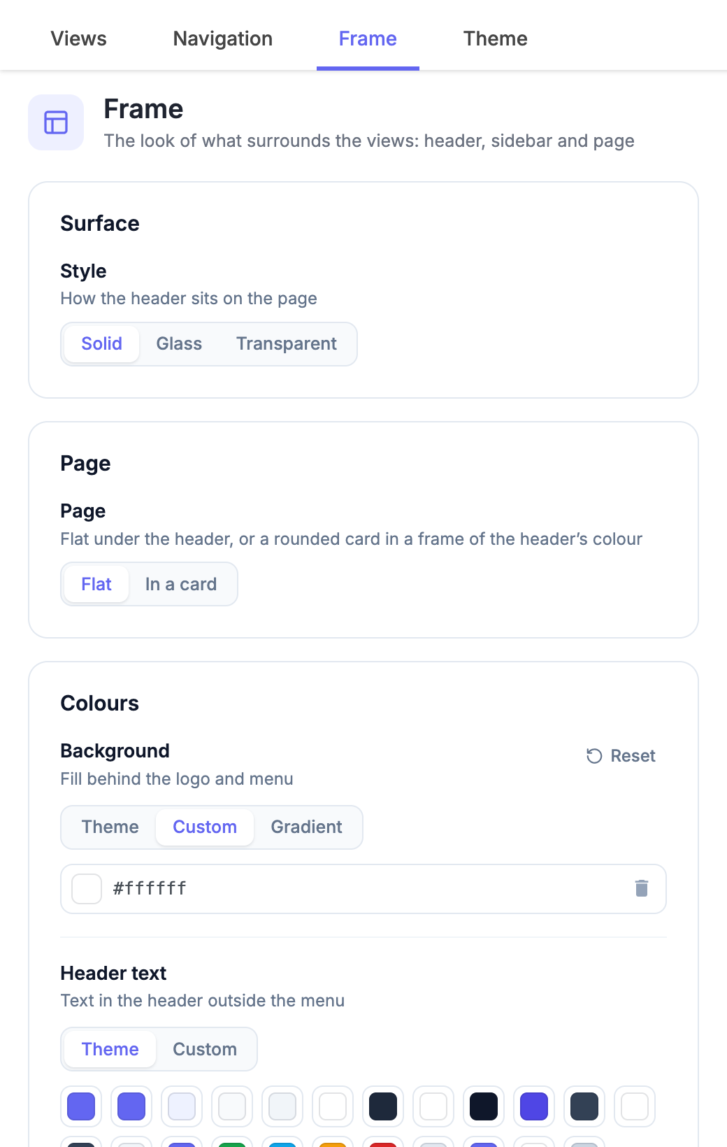
| Setting | Options |
|---|---|
| Colours | Background, header text, menu text and accent — from the theme, a custom colour, or a gradient background |
| Logo image | An image from the app's resources |
| Surface | Solid, Glass (with tint and blur) or Transparent. With glass or transparent, the page starts at the top of the window and scrolls beneath the header. |
| Menu items | How hover and the current page show: Pill, Underline or Accent tint |
| Bottom edge | Line, Shadow or None. Left unset, the sidebar layouts get a line and the top navbar gets none. |
| Height | 40, 48 or 56 pixels |
| Sidebar colours | Light, Dark, or Like the header |
| Page | Flat under the header, or In a card: a rounded card in a frame of the header's colour |
Behaviour lives on the Navigation tab and looks on the Frame tab, so you can restyle an interface without touching its menu, and the other way round.
Controlling the Menu From Scripts
context.getNavigation() returns the app's menu, so a script can show or hide entries — for example ones only some users need, or a reduced menu during onboarding.
An entry is named by the view it opens ('Reports') or by its own id ('MenuItem_7', for entries that open no view, such as submenus or script entries). Every method takes one name or an array of names, redraws the menu at once, and returns the same object so calls can be chained.
| Method | What it does |
|---|---|
hide(entries) | Hides the entries |
show(entries) | Shows entries that hide() hid |
setVisible(entries, visible) | hide() when visible is false, else show() |
only(entries) | Shows just these entries (a named submenu keeps all of its own); only(null) shows everything again |
reset() | Back to the menu as designed in the builder |
isVisible(entry) | Whether the entry is in the menu now (returns a boolean) |
// In the common view's load event: entries only some users need
const nav = context.getNavigation();
nav.setVisible('Reports', context.hasFeature('reporting'));
context.hasPrivilege({ model: 'Invoice', privilege: 'update' })
    .then(canEdit => nav.setVisible('InvoiceEditor', canEdit));
nav.hide(['Archive', 'MenuItem_7']);
// Show just a few entries during onboarding, then everything again
context.getNavigation().only(['Dashboard', 'Profile']);
// ...later
context.getNavigation().only(null);
Good to know:
- Hiding is not access control. A hidden view can still be opened by its URL. Restrict views with roles and privileges; use
getNavigation()to tidy the menu. - The rules come on top of view access: an entry for a view the user may not open stays hidden whatever the script says.
- The rules last until changed, or until another app is opened. Set them in the common view's load event so the menu is right from the first paint.
Page Headers
A page header gives a view a title bar of its own: an icon, a breadcrumb, the title, badges, a line of facts, and buttons at the end. It sits in the top bar when the interface has both a sidebar and a top bar, and in a band above the page otherwise.
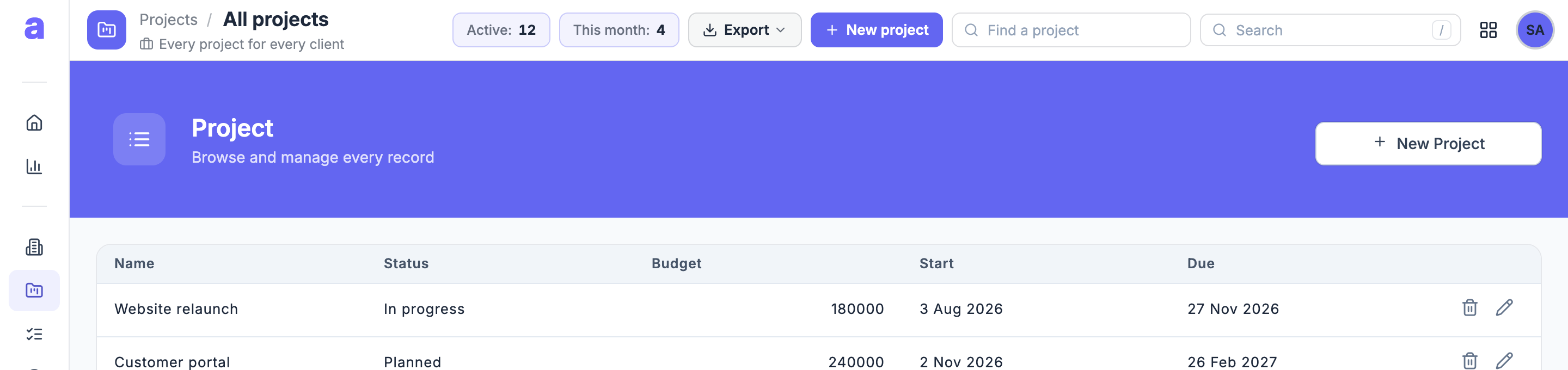
Open the view in the builder, choose its Header tab and turn on Show a page header in the top bar.
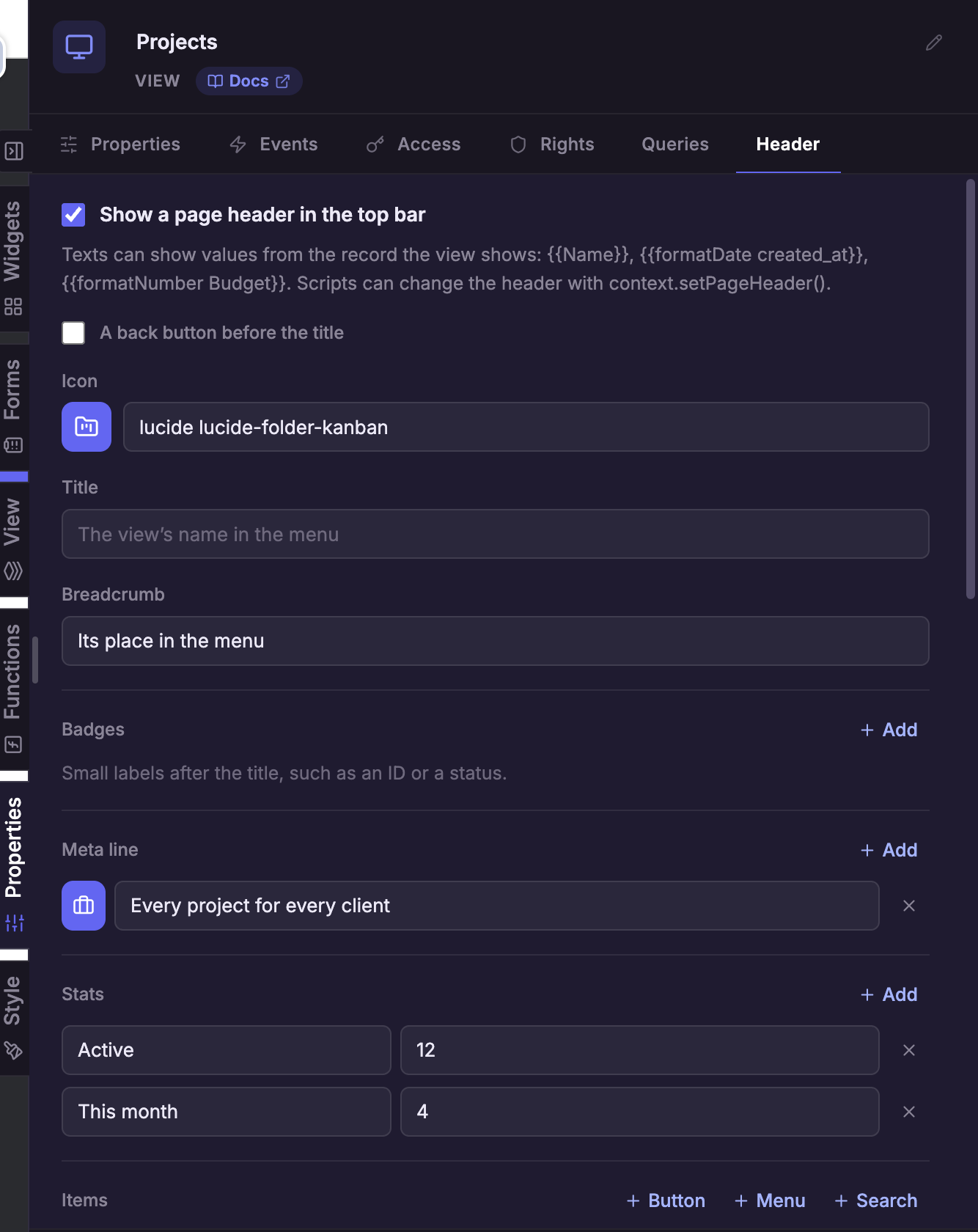
| Setting | What it shows |
|---|---|
| Icon | An icon before the title |
| Title | The title. Left empty, the view's name in the menu. |
| Breadcrumb | The view's place in the menu, or Back to a view you choose |
| Back button | A button before the title that opens a view, or goes back to the previous page |
| Badges | Small labels after the title, such as an ID or a status — each with a colour (grey, theme colour, green, amber, red, blue) and an optional dot |
| Meta line | Short facts under the title, such as when the record was created |
| Stats | Label and value chips at the end of the bar, such as Review Hours: 12 |
| Items | Buttons, menus and search fields at the end of the bar |
Texts Come From the Record
Every text is a Handlebars template over the record the view shows (the record its first form shows), so the header follows the record:
| Template | Shows |
|---|---|
{{Name}} | The record's name |
ID: {{ProjectID}} | A badge with the project's ID |
Created {{formatDate created_at "medium"}} | The creation date |
{{#if Active}}Active{{else}}Inactive{{/if}} | A status |
A badge, meta item, stat or item whose text comes out empty is left out. That makes conditions easy: {{#if canApprove}}Approve{{/if}} as a button's text shows the button only when the record allows it. A badge's colour can be a template too, for example {{#if Active}}success{{else}}neutral{{/if}}.
Items: Buttons, Menus and Search Fields
Add items with + Button, + Menu or + Search:
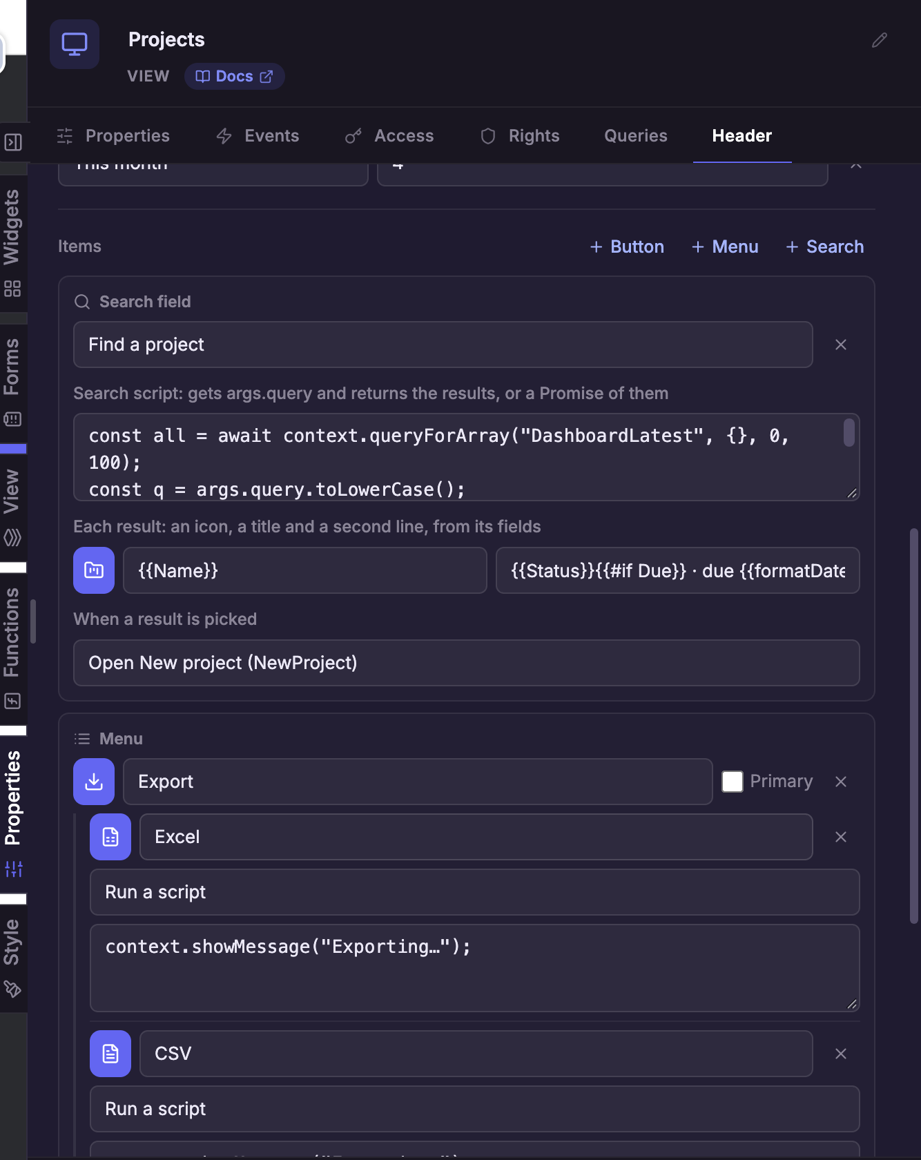
- Button — opens a view, or runs a script with
args.record(the view's record). Primary shows it in the accent colour. - Menu — a button that opens a list of entries; each entry opens a view or runs a script, like a button.
- Search field — searches as the user types, and shows the results under the field.
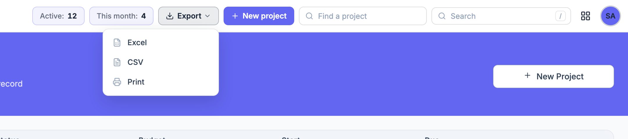
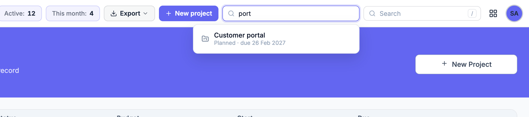
A search field's script gets the typed text as args.query (and args.record), and returns the results — an array of objects — or a Promise of them. It may await. Each result is shown with the templates you give it, filled with the result's fields: a title, a second line and an icon. When a result is picked, it opens the view you choose with the result as its record, or runs a script with args.result.
// A search field's script: projects whose name contains the typed text
return await context.queryForArray('Projects', { name: args.query }, 0, 8);
With a result title of {{Name}} and a second line of ID {{ProjectID}}, each project shows its name with its ID underneath.
Setting the Page Header From a Script
context.setPageHeader(header) sets the open view's page header from a script — for example in the view's load event, to add a button only some users get.
How it combines with the view's own Header tab:
- Only the keys you pass change; the rest keep the view's settings. A list (
badges,meta,stats,actions) replaces the view's whole list. - It shows even when the view's own header is turned off.
- It applies to the open view until another view opens.
nullgoes back to the view's own settings;falsehides the header.
The settings are the same as on the Header tab:
| Key | Type | What it sets |
|---|---|---|
icon | string | An icon class, e.g. 'lucide lucide-folder-kanban' |
title | string | The title |
parentView | string | A view the breadcrumb links back to |
back | { view, label } or null | A back button; without view it goes back in the browser history |
badges | array of { text, tone, dot } | tone is neutral, primary, success, warning, danger or info |
meta | array of { icon, text } | The line under the title |
stats | array of { label, value } | Chips at the end of the bar; an empty value shows "—" |
actions | array | Items at the end of the bar (below) |
An item in actions is one of:
- a button:
{ label, icon, primary, view, script }— opensview, or runsscriptwithargs.recordandargs.action; - a menu:
{ type: 'menu', label, icon, primary, items: [{ label, icon, view, script }] }; - a search field:
{ type: 'search', placeholder, script, result: { title, subtitle, icon }, view, pick }—scriptgetsargs.queryandargs.record; a picked result opensviewwith it as the record, or runspickwithargs.resultandargs.record.
Scripts in items run as async functions with context and args.
// A project page: breadcrumb back to the list, ID and status badges
context.setPageHeader({
    icon: 'lucide lucide-folder-kanban',
    parentView: 'Projects',
    title: '{{Name}}',
    badges: [
        { text: 'ID: {{ProjectID}}' },
        { text: '{{#if Active}}Active{{else}}Inactive{{/if}}',
          tone: '{{#if Active}}success{{else}}neutral{{/if}}', dot: true }
    ],
    meta: [{ icon: 'lucide lucide-calendar', text: 'Created {{formatDate created_at "medium"}}' }]
});
// A button only for users who may approve
const canApprove = await context.hasPrivilege({ model: 'Review', privilege: 'update' });
const actions = [{ label: 'Print', icon: 'lucide lucide-printer', script: 'window.print();' }];
if (canApprove) {
    actions.push({ label: 'Approve', icon: 'lucide lucide-check', primary: true,
                   script: 'context.setView("ApproveReview", args.record);' });
}
context.setPageHeader({ actions: actions });
// A project search and a menu of more actions
context.setPageHeader({
    actions: [
        { type: 'search', placeholder: 'Find a project',
          script: 'return await context.queryForArray("Projects", { name: args.query }, 0, 8);',
          result: { title: '{{Name}}', subtitle: 'ID {{ProjectID}}', icon: 'lucide lucide-folder-kanban' },
          view: 'ProjectView' },
        { type: 'menu', label: 'More', icon: 'lucide lucide-ellipsis', items: [
            { label: 'Print', icon: 'lucide lucide-printer', script: 'window.print();' },
            { label: 'Reports', icon: 'lucide lucide-chart-column', view: 'Reports' }
        ] }
    ]
});
// Back to the view's own header, or no header at all
context.setPageHeader(null);
context.setPageHeader(false);
Moving Apps Between Environments
Navigation layouts and page headers are stored with the user interface and its views. An app exported from an environment that has them and imported into one that doesn't yet keeps working: the older server drops the layout and the headers on import, so the app falls back to the top navbar and no page headers. Two things to know:
- Menu headings and script entries survive the import but do nothing when clicked on the older platform.
- Set the layout and headers up again once the other environment has been updated.
Next Steps
- User Interfaces Guide — views, widgets and layouts
- Rules and Actions — the scripts behind buttons and menu entries
- Security Guide — roles and privileges, the real access control behind a tidy menu