User Interface
The User Interface section is where graphical user interfaces are created for an application. A user interface is a way through which most users will interact with an app. Most apps will have a user interface for web (accessed via a web browser like Chrome, typically on a laptop or desktop), and/or a user interface for mobile. However, it is possible to create more user interfaces for an app to meet specific criteria, such as role-specific interfaces. A user interface consists mainly of views (app pages) and related elements like widgets, forms, scripts, and themes.
To create an Interface, from the My Apps page, go to the left menu, User Interface > Create Interface
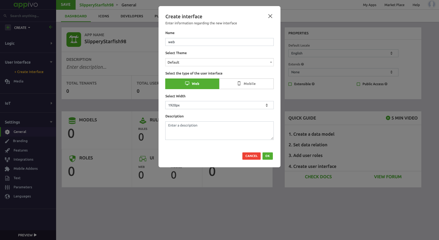
Description of fields
Web
Mobile
Web
A Web interface is used for web apps that are expected to run in a browser on non-mobile device formats. For example, use a Web interface for apps expected to run in a Chrome browser window on a laptop or desktop. A Web interface has four main components as stated below:
- View
- Menu
- Theme
- Header
View
A View is a page of an app that is visible to the users. There are two types of views in a Web interface:
- View: a normal app page
- Dialog: a pop-up window
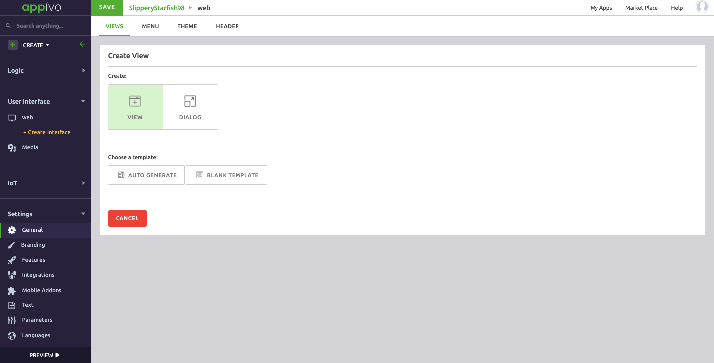
A developer has two template options for the web view:
- Auto generate
- Blank Template
Auto Generate
Auto generated views are a quick and easy way to create a view, and can be edited later.

Auto Generated views can be selected from the drop down menu in one of three types:
- Form type view
- List type view
- Home type view
Form View type
Form views are used for saving new records or editing existing records. A form view is based on a data model, and auto generating creates a view with input fields for each attribute of the selected data model. If the data model is related to other data models, the auto generated view includes fields for the attributes of those data models.
Description of fields:
List type view
List views are used for displaying a table of existing records. A list view is based on a data model, and auto generating creates a view with a DataGrid widget, with columns based on the selected data model. If the data model is related to other data models, the DataGrid widget has the option to include columns for the attributes of those data models.
List views can include navigation links to form views for creating and editing records, so create form views before list views.
Description of fields:
Home Type View
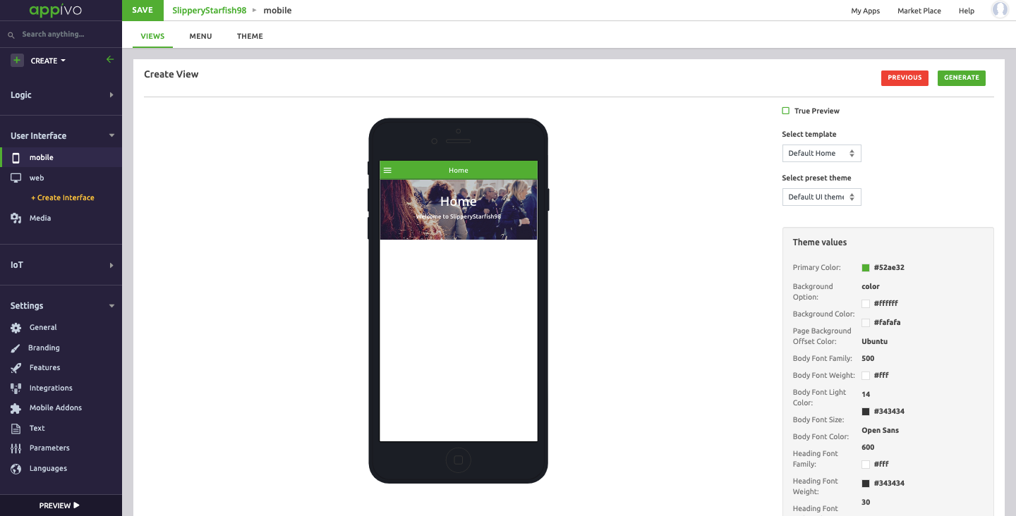
Home views are typically used for navigation and are typically configured as the initial app view. A home view is based on the other views, and auto generating one will create a view with navigation elements to each view. Create the home view after creating all other views you want it to reference.
Description of fields:
When clicking Proceed a new page opens displaying a preview of what the view will look like given the default settings. The template and theme can be changed, and the styling values are shown. Select Generate to create the page and open the view editor.

Blank Template
A blank template provides a completely blank canvas without any auto-generated or configured widgets. There are seven standard layout options, including blank for creating views completely from scratch.
Description of fields:
-Blank
-Left Menu
-Right Menu
-Top Bar And Left Menu
-Top Bar
-Bottom Bar
-Top and Bottom Bar
Upon clicking Proceed, it takes us to the View editor.
View Menu
The view menu has 4 main options. From the left hand navigation bar go to Web > View and click on the ellipses.
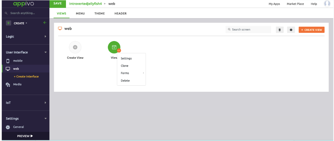
- Settings
- Clone
- Forms
- Delete
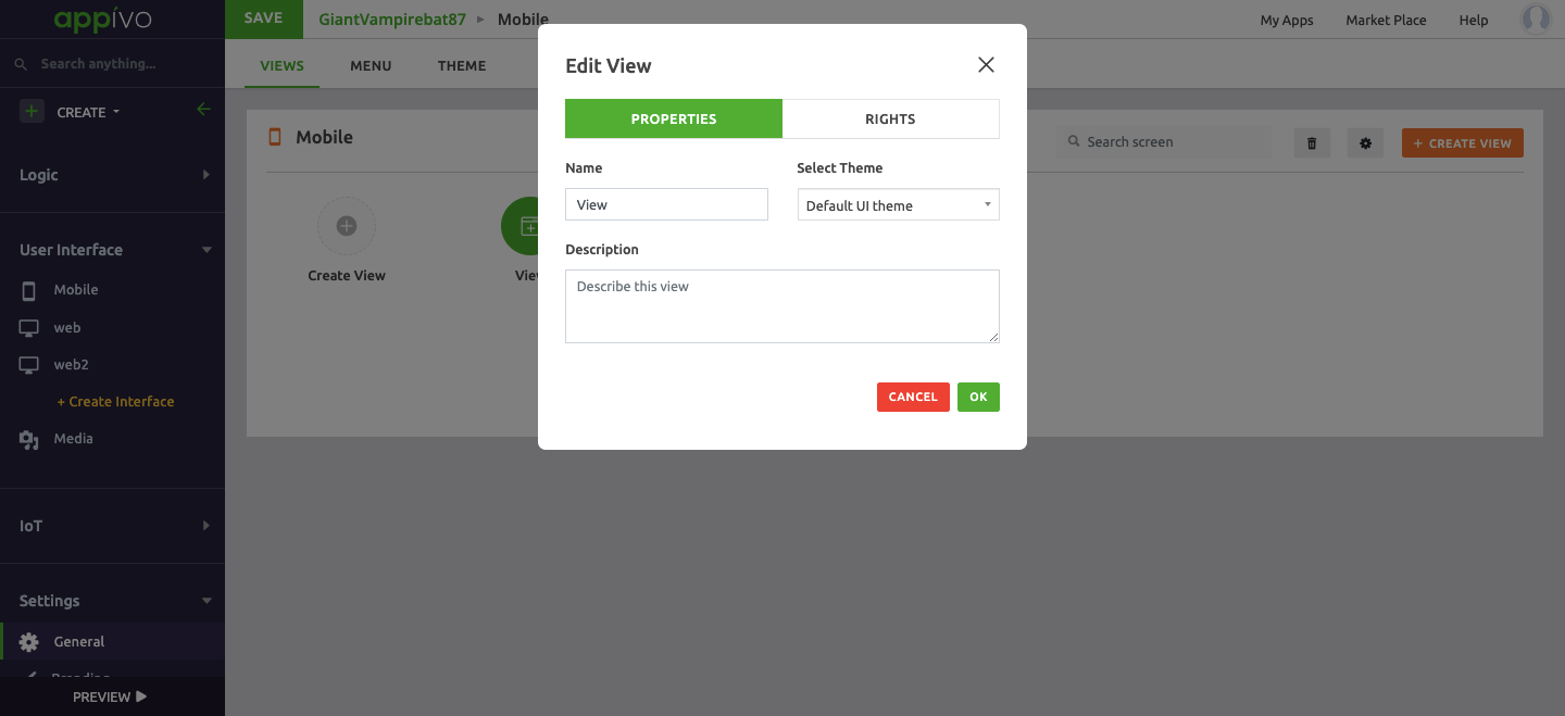
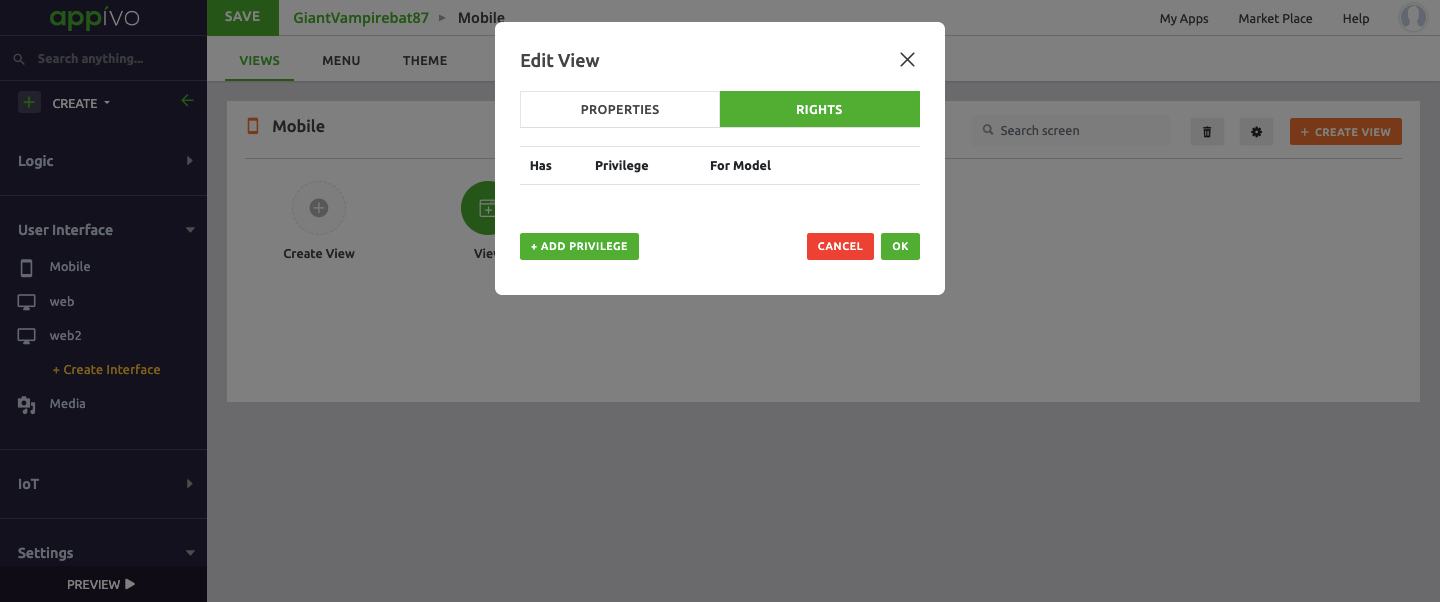
Settings
The Settings option is for editing view properties and rights.
Properties
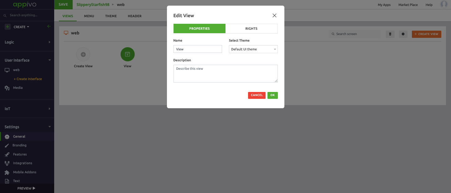
Rights
Rights define the Privileges at a view level.

Clone
The clone option creates a copy of the view. Creating a duplicate of a view is a good way to ensure consistency among views and to test out new changes to an existing view.
Forms
Form acts as a medium between user interface (UI) and database. We can create/edit records of a data-model using form. Form will have an underlying data-model whose records it handles.

Description of fields
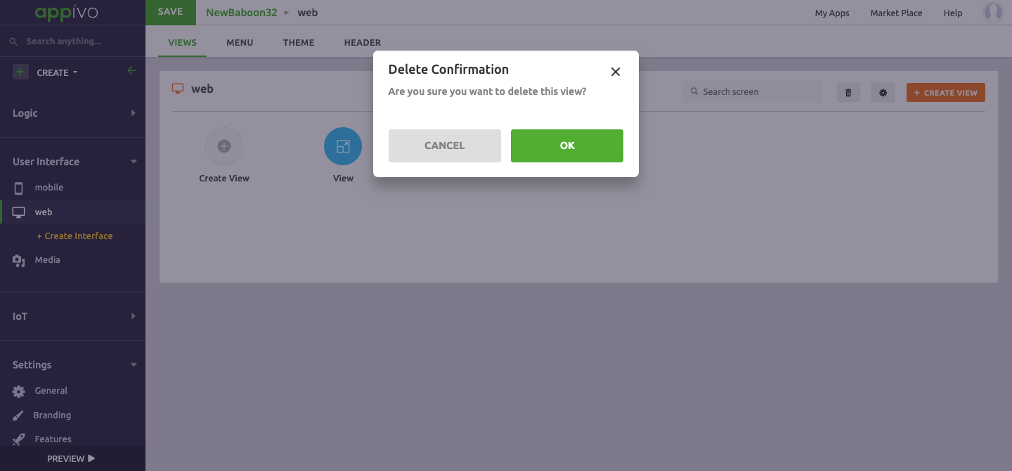
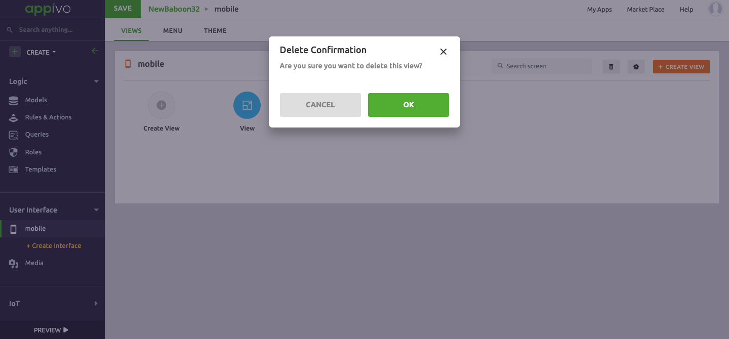
Delete
The delete option is for deleting the view. A warning pop-up window opens asking for confirmation.
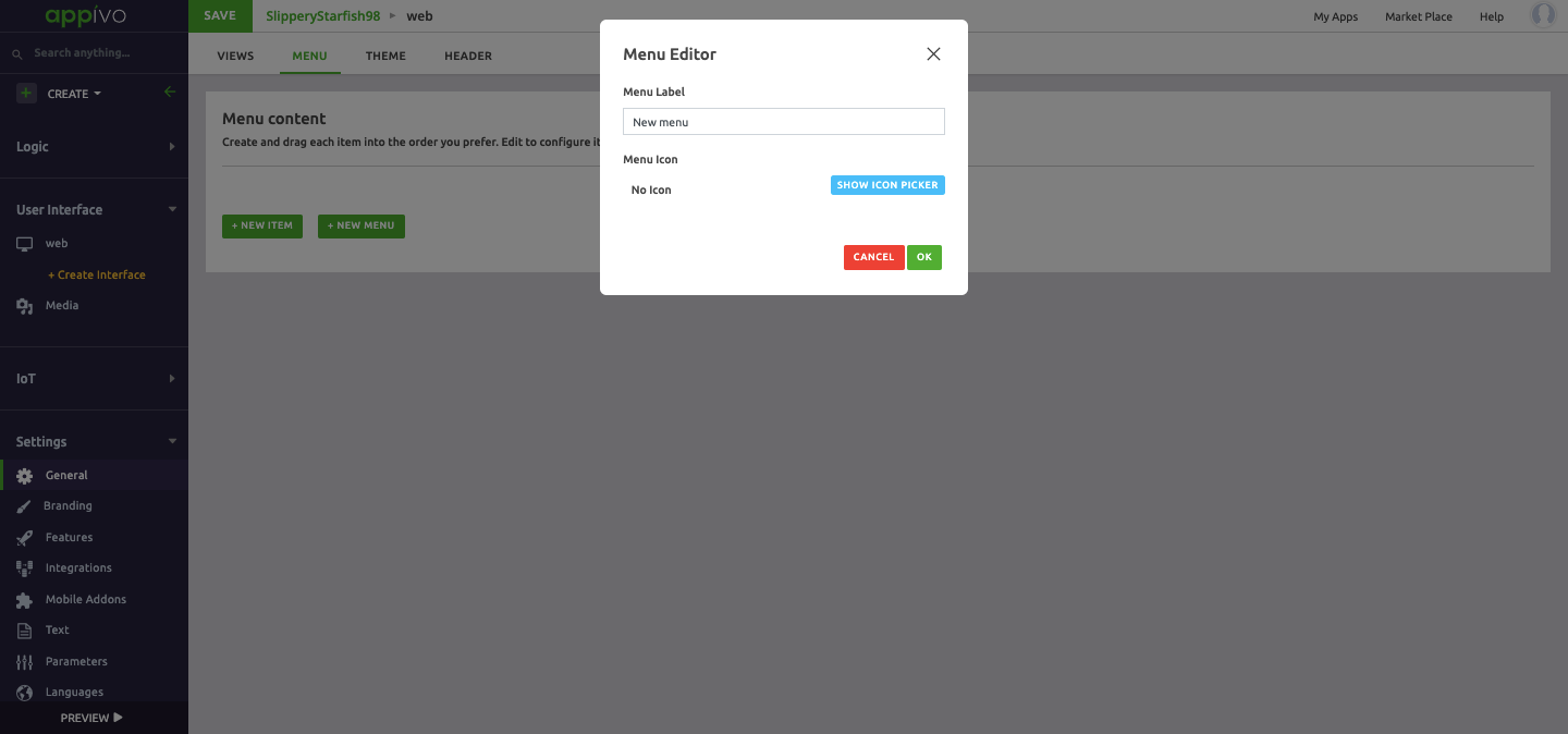
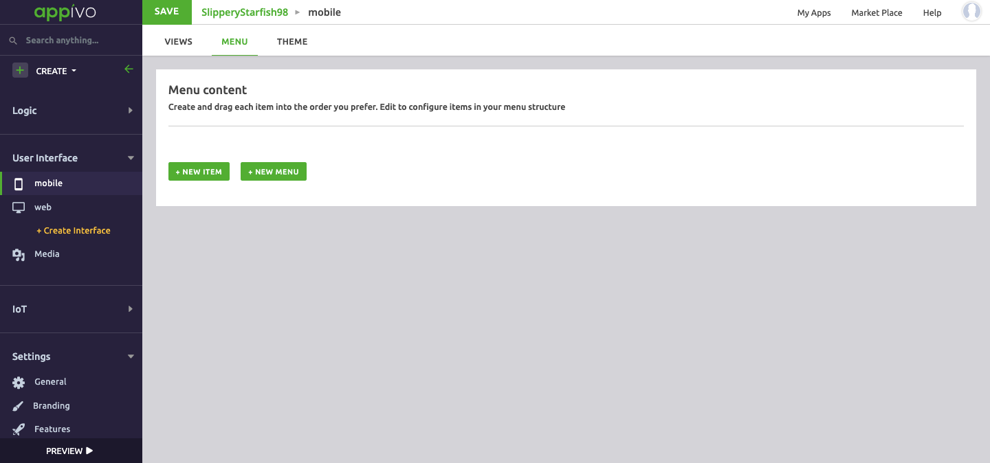
Menu
Menu is the navigation option displayed in the header.

The menu can be created, edited and configured on the basis of:
- New Item
- New Menu
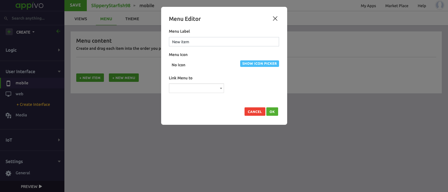
New Item
A menu Item is a label for a navigation action. Menu items typically describe the view that they link to:
- a menu item called Home would link to the app’s home view.
- a menu item called Settings would link to a view with configuration options.

Description of fields:
New Menu
A menu is a label for a container of menu items. While it’s possible to nest menus, it’s typically better to have a flat menu structure.
Description of fields:
Theme
Theme enables selecting or customizing color and other stylings applied to UI elements.

Description of fields:
– Background Layout
– Typography
– Buttons, Forms labels and more
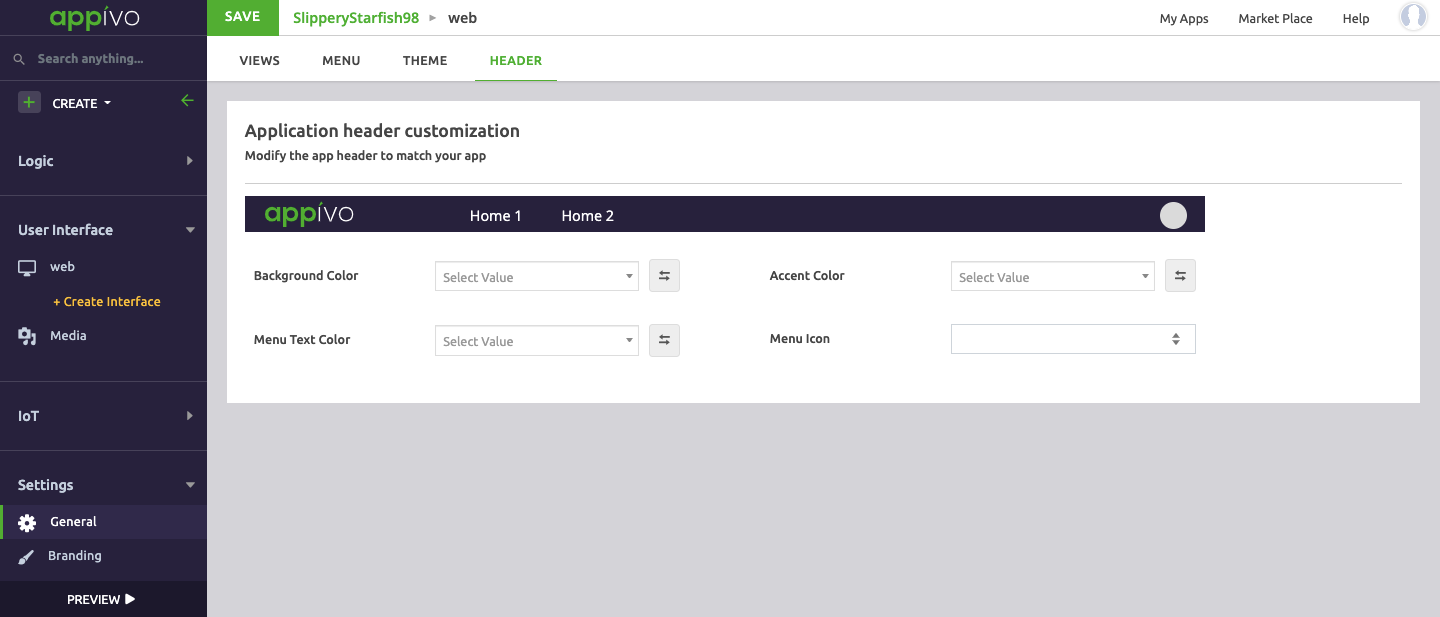
Header
The header row tops all views in a web user interface, and can be a useful place for a logo and menus. The header section controls the styling of the header row.
Description of fields:
User Interface Settings
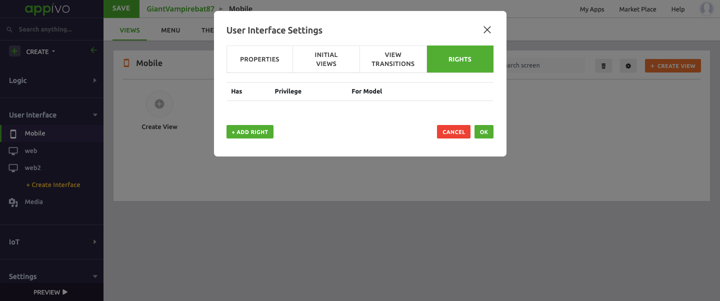
User Interface settings are used to configure general settings for a user interface, and may vary between Desktop and Mobile UIs. The settings are grouped under three tabs:
- Properties
- Initial Views
- Rights
Properties

Initial View
The initial view defines the view that users will first see when the app is launched. This can be any view in the UI, but is basically a home view that acts as a dashboard and navigational launch pad.

Click > Add New > Select from the drop down menu.
Rights
Rights define the Privileges at a view level.
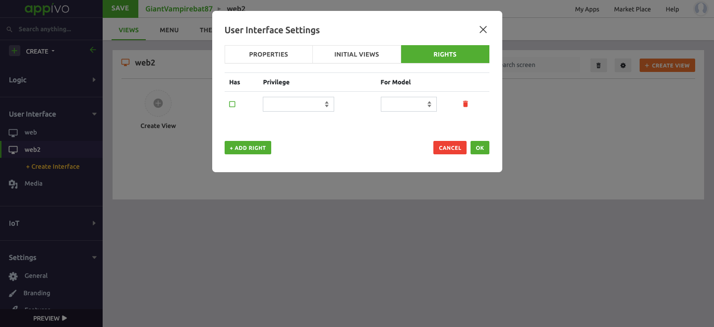
Click > Add Right > Select the parameters on the basis of the drop down menu.
Mobile
View
A View is a page of an app. There are two types of views in a Mobile interface;
- View: a normal app page
- Dialog: a pop-up window

A developer has two template options for the mobile view:
- Auto generate
- Blank Template
Auto Generate
Auto Generated views can be selected from the drop down menu in one of three types:
- Form type view
- List type view
- Home type view
Form View type
Form views are used for saving new records or editing existing records. A form view is based on a data model, and auto generating creates a view with input fields for each attribute of the selected data model. If the data model is related to other data models, the auto generated view includes fields for the attributes of those data models.
Description of fields:
List type view
List views are used for displaying a table of existing records. A list view is based on a data model, and auto generating creates a view with a DataGrid widget, with columns based on the selected data model. If the data model is related to other data models, the DataGrid widget has the option to include columns for the attributes of those data models.
List views can include navigation links to form views for creating and editing records, so create form views before list views.
Description of fields:
Home Type View
Home views are typically used for navigation and are typically configured as the initial app view. A home view is based on the other views, and auto generating one will create a view with navigation elements to each view. Create the home view after creating all other views you want it to reference.
Description of fields:
When clicking Proceed a new page opens displaying a preview of what the view will look like given the default settings. The template and theme can be changed, and the styling values are shown. Select Generate to create the page and open the view editor.
Blank Template
A blank template provides a completely blank canvas without any auto-generated or configured widgets. There are seven standard layout options, including blank for creating views completely from scratch.
Description of fields:
– Blank
– Left Menu
– Right Menu
– Top Bar And Left Menu
– Top Bar
– Bottom Bar
– Top and Bottom Bar
Upon clicking Proceed, it takes us to the View editor.
View Menu
The view menu has 4 main options. From the left hand navigation bar go to Mobile > View and click on the ellipses.

- Settings
- Clone
- Forms
- Delete
Settings
The Settings option is for editing view properties and rights.
Properties
Rights
Rights define the Privileges at a view level.
Clone
The clone option creates a copy of the view. Creating a duplicate of a view is a good way to ensure consistency among views and to test out new changes to an existing view.
Forms
Form acts as a medium between user interface (UI) and database. We can create/edit records of a data-model using form. Form will have an underlying data-model whose records it handles.
Description of fields
Delete
The delete option is for deleting the view. A warning pop-up window opens asking for confirmation.
Menu
Menu is the navigation option displayed in the header.
The menu can be created, edited and configured on the basis of:
- New Item
- New Menu
New Item
A menu Item is a label for a navigation action. Menu items typically describe the view that they link to:
- a menu item called Home would link to the app’s home view.
- a menu item called Settings would link to a view with configuration options.
Description of fields:
New Menu
A menu is a label for a container of menu items. While it’s possible to nest menus, it’s typically better to have a flat menu structure.

Description of fields:
Theme
Theme enables selecting or customizing color and other stylings applied to UI elements.

Description of fields:
Background Layout
Typography
Buttons, Forms labels and more.
User Interface Settings
User Interface settings are used to configure general settings for a user interface, and may vary between Desktop and Mobile UIs. The settings are grouped under four tabs:
- Properties
- Initial Views
- View Transitions
- Rights
Properties

Initial View
The initial view defines the view that users will first see when the app is launched. This can be any view in the UI, but is basically a home view that acts as a dashboard and navigational launch pad.

Click > Add New > Select from the drop down menu.
View Transitions
Select the view for transitions.
Rights
Rights define the Privileges at a view level.
Click > Add Right > Select the parameters on the basis of the drop down menu.
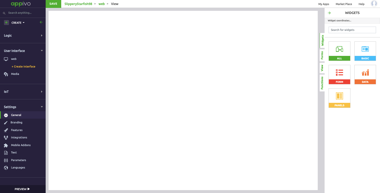
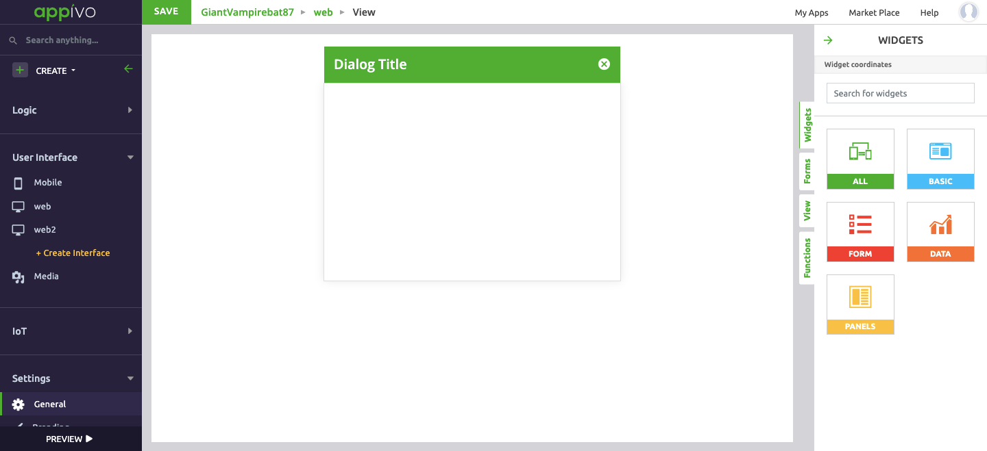
View Editor
The View Editor is where a view (app page) is created. Views are created by dragging widgets into place and combining them with forms, events and other logic. View Editor functionality is grouped into four tabs:
- Widgets tab
- Forms tab
- View tab
- Functions tab
Widgets tab
A widget is a visual element that is placed on a view of a user interface. Widgets include icons, drop-down menus, buttons, frames, grids and many other elements for displaying information and interacting with data.
Right Click menu
The widget right-click menu provides several options depending on the widget. See the widget documentation for more information on widget-specific features and configurations. Some of the comment menu options are listed below.

Widget Category
Widgets are categorized on the basis of:
- All
- Basic
- Form
- Data
- Panels
All
All will display all the widgets from each category.
Basic
Basic will display a list of common and miscellaneous widgets.
Form
Form will display all the widgets that can be used with forms (consider them as form elements).
Data
Data will display widgets and give a wide range of options to represent your data in a chart, pie chart, calendar and many more.
Panel
Panel will display all the widgets that are mainly containers.
More information is available in the Widgets.
Forms Tab
The form tab is one of the most important building blocks of an Appivo application. You can think of a form as a bridge between the user interface and the database. The form holds data for a specific record in the database, the record may or may not already exist in the database.
The form must be bound to a model so that the system knows what attributes are expected to be filled in and how they should be validated. A form can be loaded with a specific record or it could start out empty if a new one is to be created. When the form is submitted the record is written to the database – a new record will be created and an existing record will be updated.
As mentioned earlier – the form is a bridge and what we just described is the database end of this bridge, the other end is how the form allows widgets to be connected to the individual attributes of the record. For instance, a TextField can be connected to a String-attribute of a form – that TextField will then represent the value of that particular attribute, of the record loaded into the form.

In a similar fashion some widgets can represent a relationship, a set of related records, and thus being able to connect to a relation that the record has, again via the form. Examples of such widgets are the DataGrid and the Chart.
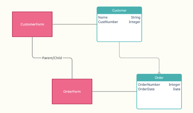
Let’s go over an example to illustrate these concepts. We are building an application for handling orders and we have an initial data model that looks like this:

We have just two models – Customer and Order, a Customer can have many Orders and an Order belongs to exactly one Customer. In our simple example here these models just have a very minimal set of attributes. To illustrate how forms can be used we will create two views – one for creating a Customer and one for viewing a Customer and its list of Orders.
Creating or editing a record
It is possible to auto-generate a view for this purpose but we will build it from scratch so that you will understand the inner workings of how the view is connected to forms and widgets.
Start with creating a view with an appropriate name. Choose to use a blank template.

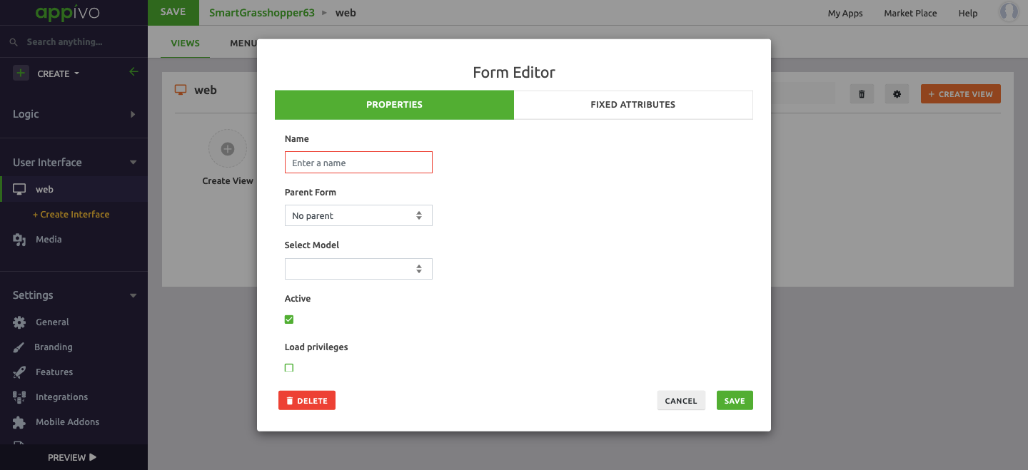
Add a form and connect it to the Customer-model. You will find the forms tab in the right panel of the builder. Here you will see a list of all the forms in the current view. Click the “Add form” button to add our Customer-form.

You will need to name the form and you must pick what model to connect it to. There is a concept of parent and child forms as well, we will discuss that later.
Once you’ve added the form you can go ahead and add some widgets to your view. Our Customer-model has only two attributes – one for the name and one for the customer-number. Drag out a TextField-widget – the widget-editor will open up and it should’ve automatically connected itself to the Name-attribute of the Customer-form.

Place the widget and then do the same with a NumberField – it will auto-connect to the CustomerNumber-attribute. After doing this and perhaps adding some labels your view should look something like this:

Finally we would need a way to submit our form. Lets add a button for that, just drag out a Button-widget:

Change the label to “Submit” and the click on the events tab, we must now declare what should happen if the button is clicked:
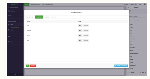
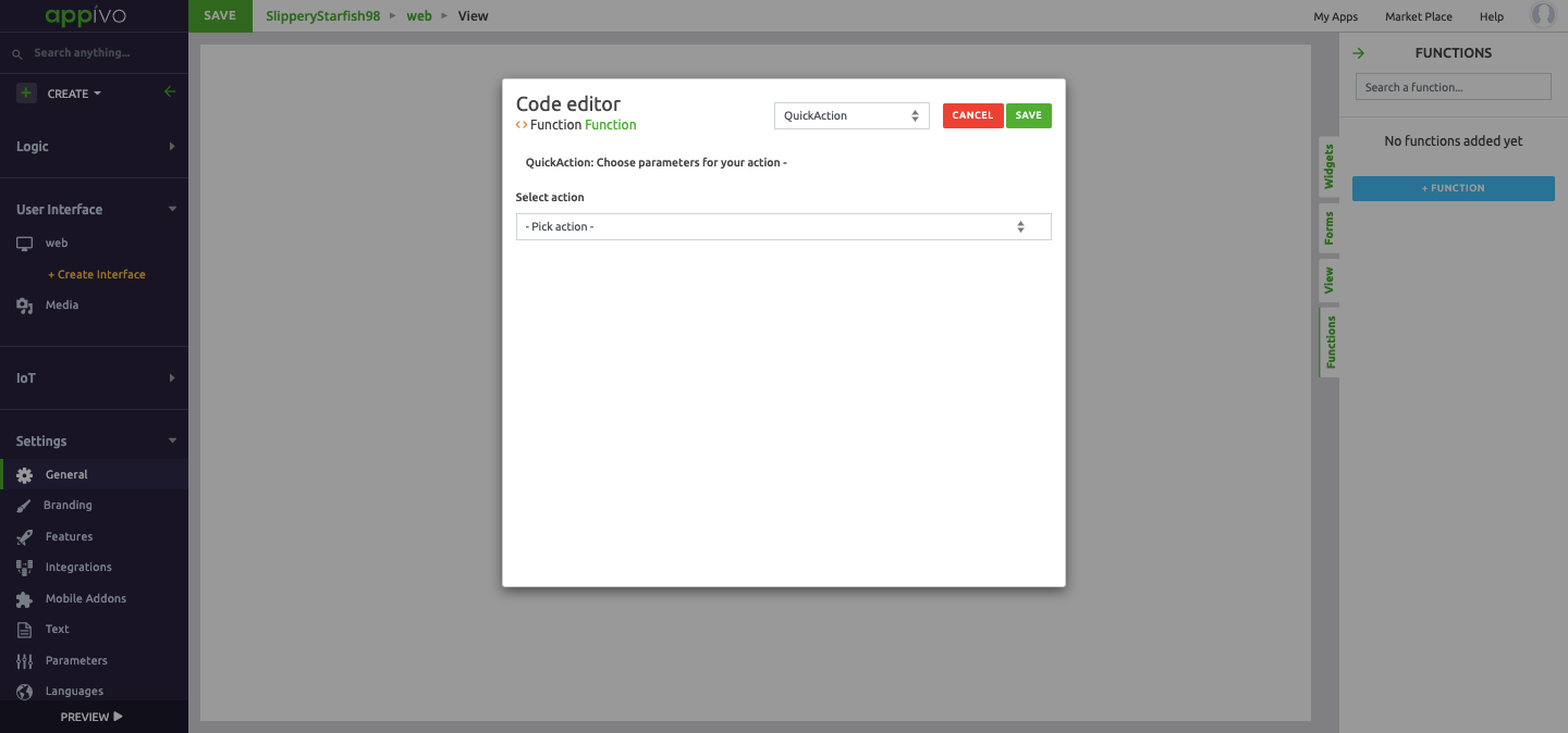
Click “Add” on the Click-event to add an event handler. You will get a scripting dialog, looking like this:

Scripts can be declared in a number of ways, the simplest one being using QuickActions. Click the Action-select and pick the “Submit form”-action, this will add some more fields and you will need to select which form to submit, pick your Customer-form. This is it, you have now created a view that can be used for creating, editing and even simply viewing a record.
Connecting relations
The model we created earlier has a relationship between Customer and Order, a Customer can have many Orders. What if we wanted to display a list of all the Orders that a customer have placed, could we do that in a simple way ?
The answer is of course yes. Just like some widgets can be connected to model-attributes there are other widgets that can be connected to relationships. The DataGrid-widget is often used to display lists of records and can easily be connected to a relationship. Drag out a DataGrid and drop it on your canvas, it will attempt to connect to a relationship. You should see something like the below screen:

The system will now automatically load and display any related orders when this view is opened.

DataGrids even support inline editing of records (that needs to be enabled on a per column-basis, see the DataGrid documentation).
Navigation and forms
When opening a view or a dialog one may provide three arguments:
- The name of the user interface
- The name of the view
- The ID of a record to open
There are QuickActions for opening views and dialogs as well as a javascript API, but one can also construct a URL that will open up a view with all these three components on the following format:
Here’s a concrete example:
Opening a view using the javascript API is done like this:
1 context.setView("Customer", id);
The record-ID is optional, if it is passed it will be interpreted as the ID of a record to be loaded in to the views root-form. The root-form is either the first form declared, or the form that is the parent of the other forms. If you open a view passing in a record ID the form will get populated and all widgets connected to it will display the values of the attributes they are connected to. If the user makes changes to these values they will get persisted once the form is submitted.
In a similar fashion, if one opens a view with a form without passing a record ID no record can be loaded and we will be starting with an empty slate. In this case the widgets will display the default values of the attributes they are connected to, if any. Submitting such a form will result in the creation of a record.
Advanced concepts
Parent & child forms
Just as the models form a hierarchy derived from their relationships forms can mimic those. For example if we want create a view where we create two related records, say Customer and Order, in one go – we could do so by creating two related forms:
Keep in mind that a form can only every display the contents of a single record – and notice here that our relationship between Customer and Order allows a Customer to have many Orders. So with forms declared as in our diagram above we could represent a specific Customer with one specific Order. If we would want to display a Customer and all his Orders we would need to the relationship Order not to a Form but to a widget capable of display a collection of records, such as the DataGrid.
Loading relations
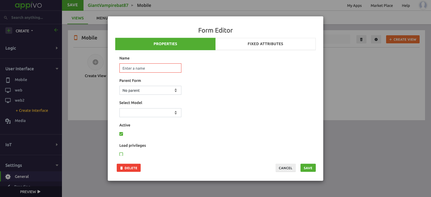
As you connect widgets to a form the platform will automatically load related records as needed. Sometimes however there are cases where the platform cannot “see” what additional related records you need (it could that you wish to display them using an HTML-widget for instance, or maybe you just need them for a computation). For these cases you can configure the form to forcefully load these required relations, that is done via the form-editor:
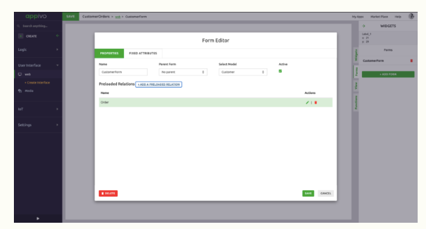
Notice that you can traverse relations here forcing an entire hierarchy of records to be loaded. This should be done with care and only if truly needed as it may increase the load time of your view.
Description of fields: Properties
Fixed Attributes
Select
Views tab
The user can edit the widgets and switch between the tree and list view modes from the upper-right corner of the toolbox.
Tree view displays the hierarchy of widgets included in the view.
List view displays a list of widgets included in the view.

Click on the ellipses for the following functions:
- Edit: Opens a widget editor.
- Events: Opens a widget editor with ‘events’ tab in-view.
- Style: Opens a style editor.
- Copy: Copies the widget.
- Cut: Cuts the widget.
- Maximize: Only for panel/Split Panels/Grids/Html.
- Minimize: Only for panel/Split Panels/Grids/Html.
- Delete: Deletes the widget.
Function tab
Functions can be added to a view for use by other elements. Added functions can be called by events such as view load, widget click, etc.
Three types of functions are available:
- QuickAction
- Logic
- JavaScript
QuickAction
Quick actions enable you to choose parameters for your actions.
Select action from the drop down list:
- Go to view
- Go to User Interface
- Go Back
- Open Dialog
- Close Dialog
- Display Notification
- Play Sound
- Format Date
- Delete active record
Go to view
Navigate to the specified view and optionally display selected record data in that view.

Description of fields:
Go to User Interface
Navigate to the specified user interface and display the default view or selected view, and optionally display selected record data in that view.

Description of fields:
Go Back
Navigate to the previous view.

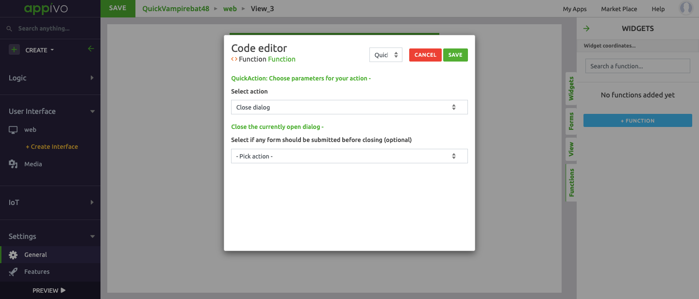
Open Dialog
Open the specified dialog and optionally display selected record data in that view.

Description of fields:
Close Dialog
Close the specified dialog and optionally display selected record data in that view.
Description of fields
Display Notification
Display a custom text notification of type Error, General or Success.

Description of fields:
Play Sound
Play the selected sound from previously uploaded media resource files.

Description of fields:
Format Date
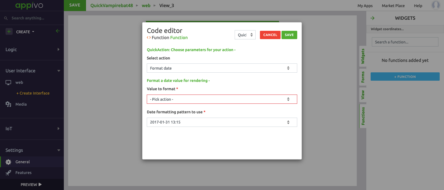
Description of fields:
Delete active record

Description of fields:
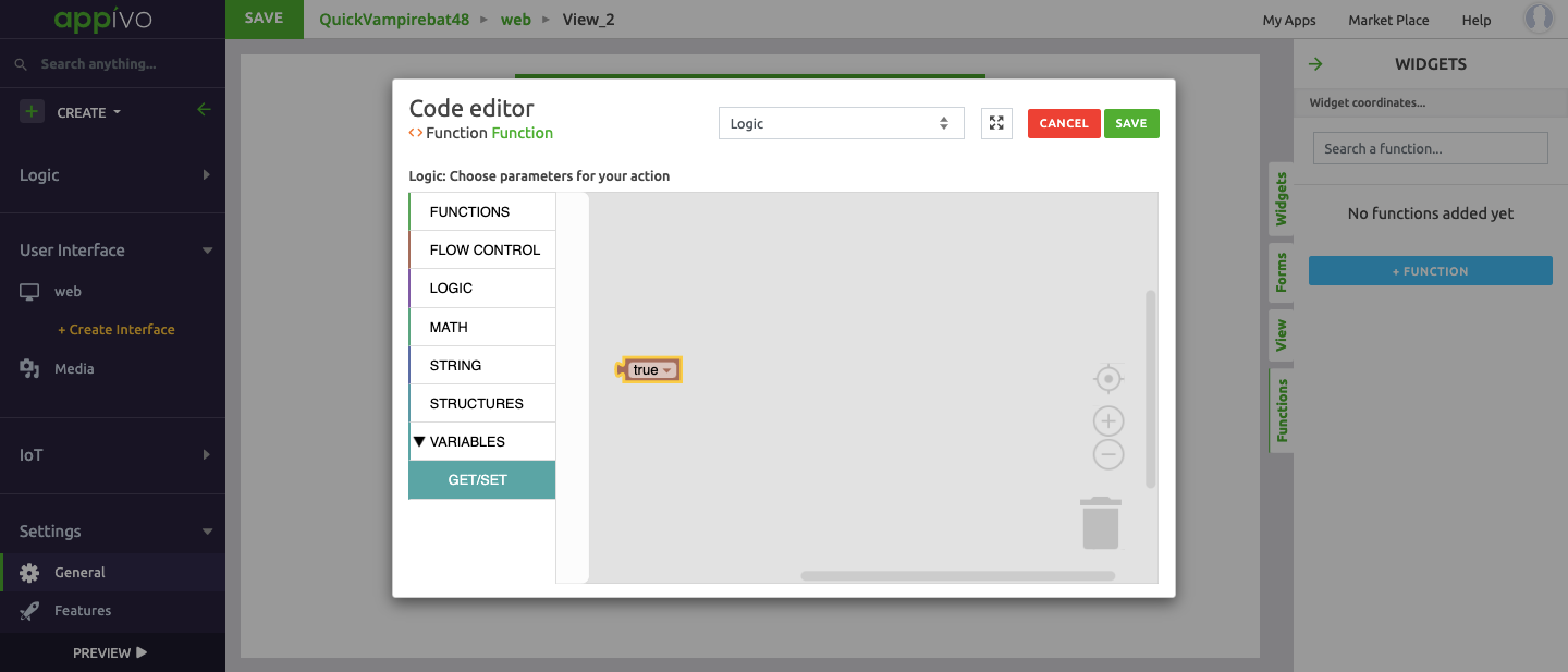
Logic
Logic enable to choose parameters for your actions on the following basis:
Functions
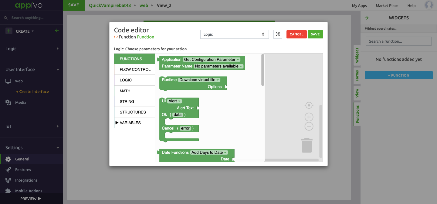
Logic
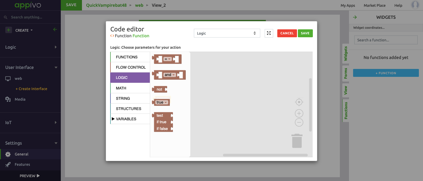
Math

String

Structures

Variables
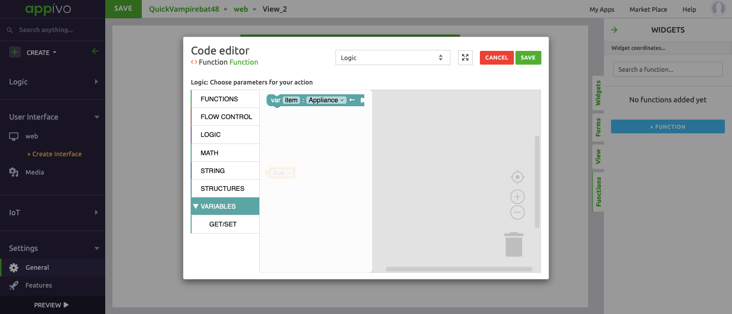
Get/Set
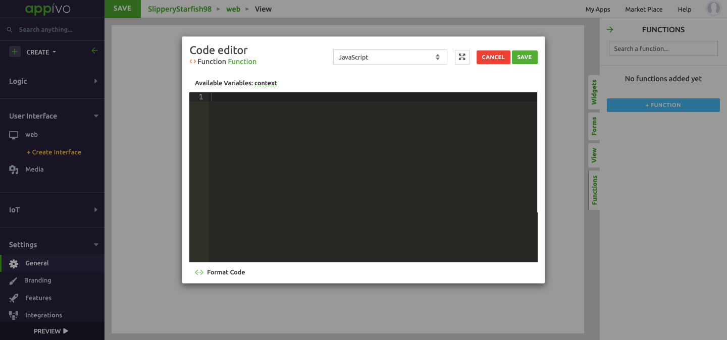
JavaScript
Three types of options are available:
- Predefined actions
- Logic
- Javascript
So when you don’t want to choose an available option and write your own code that should get executed when the function is called then you write it by selecting the javascript option.
Available variables : context.
Media
Media section is the set of resources that an application uses and enables an app developer to upload media resource files like images, animated GIFs and videos or audio clips for sound effects to be used within an app. Other binaries or documents; like a pdf or a word-document, or an XML-file can be used by Image or Video-widgets and even referenced by code and templates.
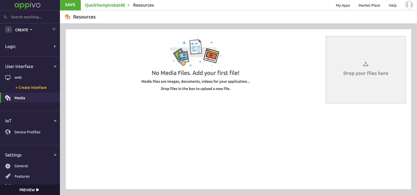
To add media resources, drag files to the designated space or click on Drop your files here, then select the file location.
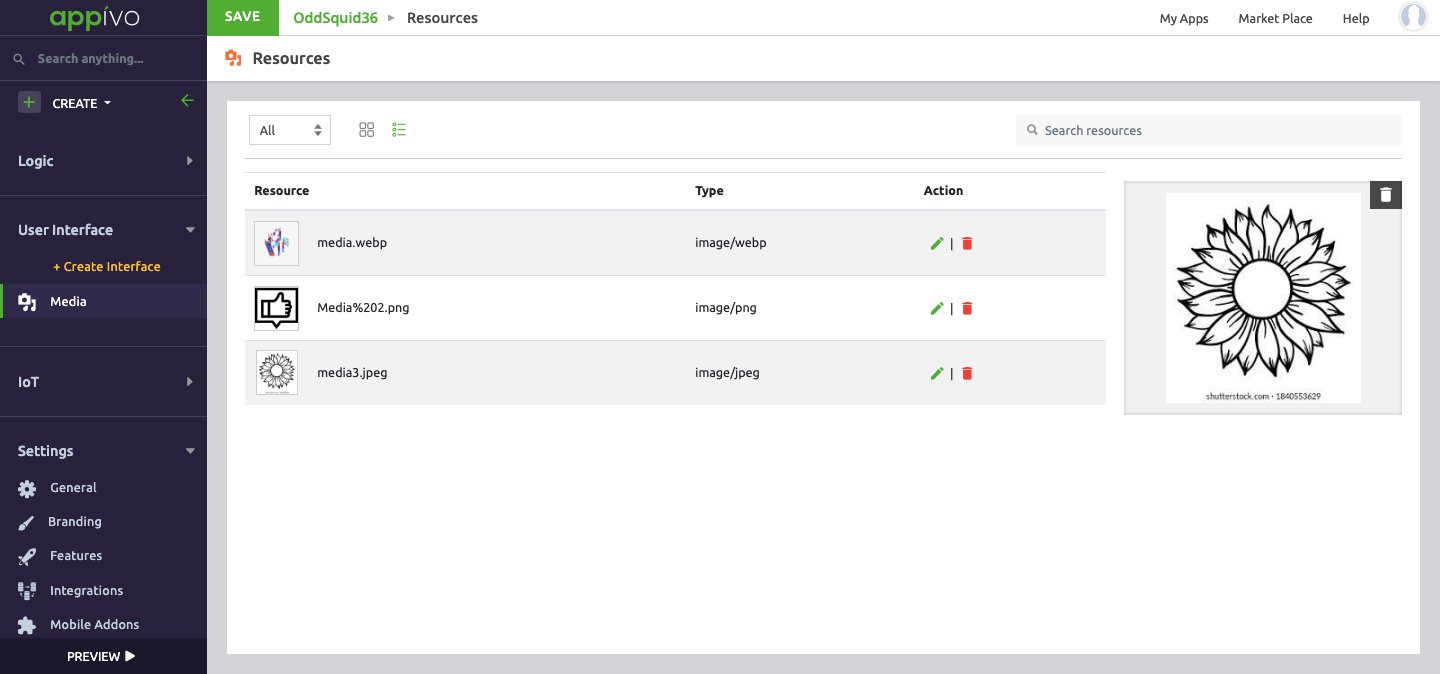
Image files can be cropped before saving. The image can be stored in:
- Grid view
- List View
Click Options.
– JPEG
– SVG
– WebP
– MP4
– MPEG4
Up Next
No Topics.