The Calendar widget is a simple and easy-to-use widget that displays links to posts by date. It allows the user to select a date from a graphical calendar.


  • UI Type:

Extends: BaseWidget

For calendar widget, the related model should have following attributes types:

Required attributes

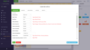
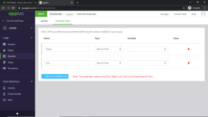
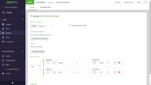
Next, create a query as follows (refer below images) and attach the query to the calendar widget.

Query parameter

Query conditions

Properties

Name Desciption
Before MoveFunction before a move occurs.
Color FunctionFunction for coloring events.
Default Calendar ViewDefault Calendar's view.
DisabledThe widget cannot be used.
End TimeAttribute for an event's end time.
Filter FunctionFunction for filtering events.
HiddenHides the widget from the user.
Hide HeaderEnable to remove header settings.
Interval (days)Attribute for an event's daily interval.
Interval (months)Attribute for an event's monthly interval.
Interval (weeks)Attribute for an event's weekly interval.
Interval (years)Attribute for an event's yearly interval.
Interval ExceptionsRelation to use for exceptions in an event's recurring interval.
Label FunctionFunction for generating event labels.
Length (repeating events)The length (in hours) of repeating events.
MaximizeSet this widget to be maximized (take up all available space).
Model NameModel for the calendar's data.
Replace TimeThe start time of the event to replace with the exception.
Start TimeAttribute for an event's start time.
Tab IndexThe Tab Index is an integer that tells the order of the widget when using the tab-key to move from one widget to another.
Title AttributeAttribute for an event's title.

Style

Name Desciption
Accent color for secondary bar and button backgroundsThe background color for the secondary bar of the calendar.
Alternate background for listAlternate background color for list type calendar.
Background for today buttonThe background for Today’s date is set by clicking on this button.
Background-colorChange background color of the widget.
Button color for top barThis is Background color for Top bar and not Button color for top bar. Is it used to change the background of the header bar of the calendar widget.
Calendar border colorThe border color for the calendar.
ColorColor of the text inside the widgets. May not apply to all text inside all widgets.
Color for month headerThe change in the font color of the button month in the calendar header bar. Month button is used to go to the month view in the calendar.
Color for today buttonCalendar has a button named Today, clicking on which will set your date to Today’s date, this is to set that button’s font color.
Event background colorThe background color for the event indicator in the calendar.
Event border colorThe border color for the event indicator in thee calendar.
Font SizeSet the font size in pixels for text.
List background hoverHover background color for list items in list style calendar.
Present day highlightBackground color for the present day in the calendar.
Selected date backgroundTo change the background color of a date which you have selected in the calendar.
Text color for top barThe text color in the top bar of the calendar.
Text-alignmentSet left, centered or right. Applies both to icon and text.
Top bar backgroundThe background color for top bar of the calendar.

Events

Name Description Event Attribute
Blur Event when a widget goes out of focus
event The event that gets triggered when the user "leaves" an element.
Change Event triggered after the element has finished changing.
Click Event that triggers based on touch or click.
event The event that triggered the handler.
DblClick Event that triggers based on double click.
event The event that triggered the handler.
Focus Event when indicating/ highlighting widget using the cursor.
event Focus is the event that gets triggered when a user makes an element come into focus, by clicking on it.
ItemClick Triggered when an item in a list, table or a calendar is clicked
RowDblClick Triggered when a user double clicks on a row

Function

addQueryParam ( )

clearQueryParams ( )

getActiveDate ( ) →{ Date }

Returns the currently selected date.

Returns

The currently selected date.

gotoDate ( date: Date )

Selects the specified date in the calendar.

Parameters
Name Type Description
date Date The date to select.

refresh ( )

Refreshes the calendar

blur ( )

Triggers the blur event.

focus ( )

Triggers the focus event.

get ( name: String ) →{ Object }

Gets the value of the specified property.

Parameters
Name Type Description
name String The name of the property.
Returns

The property's value.

getId ( ) →{ ID }

Returns the ID of the widget.

Returns

The ID of the widget

getValue ( ) →{ Object }

Returns the widget's value.

Returns

The widget's value.

hide ( )

Hides the widget.

isEnabled ( ) →{ Boolean }

Returns true if the widget is enabled.

Returns

True if enabled, otherwise false.

isHidden ( ) →{ Boolean }

Returns true if the widget is hidden.

Returns

True if hidden, otherwise false.

set ( name: String , value: Object )

Sets the value of the specified property.

Parameters
Name Type Description
name String The name of the property.
value Object The new value.

setEnabled ( Enabled: Boolean )

Enables/disables the widget.

Parameters
Name Type Description
Enabled Boolean True to enable the widget, false to disable.

setStyle ( Object: Object )

Set the widget-style

Parameters
Name Type Description
Object Object properties

setValue ( value: Object )

Sets the widget's value.

Parameters
Name Type Description
value Object The new value.

show ( )

Shows the widget.