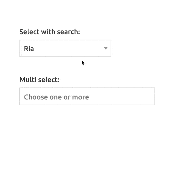
The Select2 widget is a jQuery based replacement for select boxes. It supports searching, remote data sets, infinite scrolling of results, and pagination.


  • UI Type:

Extends: BaseWidget

Properties

Name Desciption
Create Options
DisabledThe widget cannot be used.
HiddenHides the widget from the user.
Option Formatter
PlaceholderValue to display until the user has entered something. This can provide the user with a clue as to what type of information is requested in the field.
Result Formatter
Tab IndexThe Tab Index is an integer that tells the order of the widget when using the tab-key to move from one widget to another.

Style

Name Desciption
Background-colorChange background color of the widget.
Border colorAdd the color for the border.
Border radiusAdd curves to the borders of the widget.
ColorColor of the text inside the widgets. May not apply to all text inside all widgets.
Drop arrow colorThe color of the arrow for the dropdown.
Font SizeSet the font size in pixels for text.
Label background (multi select)The label background color for the multi tags in select widget.
Label font size (multi select)The text size of labels in multi-age selects.
Label text (multi select)The text color in labels for the multi tags in select widget.
Padding
Text-alignmentSet left, centered or right. Applies both to icon and text.

Events

Name Description Event Attribute
Blur Event when a widget goes out of focus.
event The event that gets triggered when the user "leaves" an element.
Change Event triggered after the element has finished changing.
Click Event that triggers based on touch or click.
event The event that triggered the handler.
DblClick Event that triggers based on double click.
event The event that triggered the handler.
Focus Event when indicating/ highlighting widget using the cursor.
event Focus is the event that gets triggered when a user makes an element come into focus, by clicking on it.
KeyUp Event triggered to an element when the user releases a key on the keyboard
event Object with information about the code, key and key code that triggered the event.
OptionAdded Triggered when a new option is added to select list.
data Object containing the record that was added.

Function

getDisplayValue ( ) →{ String }

Returns the currently displayed value.

Returns

The currently displayed value.

getOptions ( ) →{ Array }

Returns the currently selectable options

Returns

An array of all of the currently selectable options.

getSelectedRecord ( ) →{ Record }

Returns the currently selected record.

Returns

The currently selected record.

reload ( )

Refreshes the widget.

setOptions ( options: Array )

Sets widget's selectable options to the options in the provided array.

Parameters
Name Type Description
options Array An array containing option values.

blur ( )

Triggers the blur event.

focus ( )

Triggers the focus event.

get ( name: String ) →{ Object }

Gets the value of the specified property.

Parameters
Name Type Description
name String The name of the property.
Returns

The property's value.

getId ( ) →{ ID }

Returns the ID of the widget.

Returns

The ID of the widget

getValue ( ) →{ Object }

Returns the widget's value.

Returns

The widget's value.

hide ( )

Hides the widget.

isEnabled ( ) →{ Boolean }

Returns true if the widget is enabled.

Returns

True if enabled, otherwise false.

isHidden ( ) →{ Boolean }

Returns true if the widget is hidden.

Returns

True if hidden, otherwise false.

set ( name: String , value: Object )

Sets the value of the specified property.

Parameters
Name Type Description
name String The name of the property.
value Object The new value.

setEnabled ( Enabled: Boolean )

Enables/disables the widget.

Parameters
Name Type Description
Enabled Boolean True to enable the widget, false to disable.

setStyle ( Object: Object )

Set the widget-style

Parameters
Name Type Description
Object Object properties

setValue ( value: Object )

Sets the widget's value.

Parameters
Name Type Description
value Object The new value.

show ( )

Shows the widget.