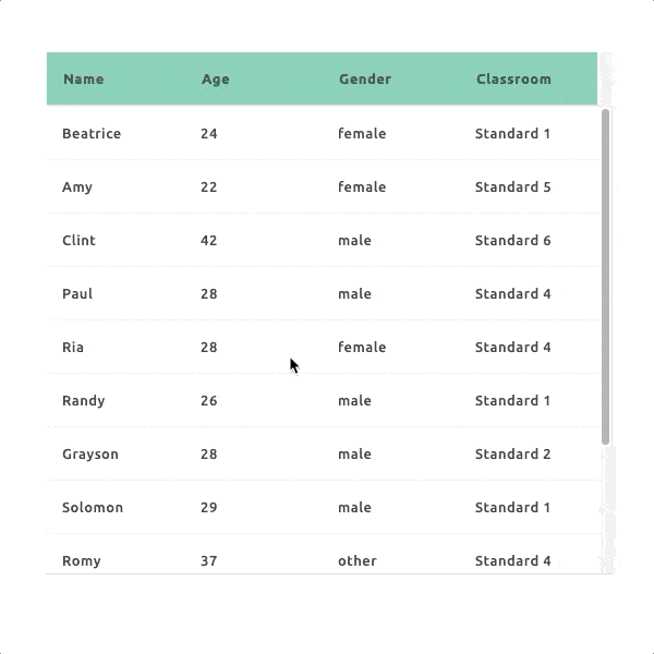
The DataGrid widget displays records in a tabular form with each attribute in its own column, much like a spreadsheet.
- UI Type:
- Properties 18
- Style 33
- Background image for grid
- Background-color
- Body border color
- Body border style
- Body border width
- Body text boldness
- Body text color
- Cell Border color
- Cell border width
- Cell padding (right left)
- Cell padding (top bottom)
- Color
- Editable cell hover background color
- Editable cell hover border color
- Font Size
- Head background color
- Head column hover color
- Header text boldness
- Header text color
- Row background color
- Row border radius
- Row hover background color
- Row hover color
- Row margin (top bottom)
- Row vertical alignment
- Summary background color
- Summary font size
- Summary text boldness
- Summary text color
- Table body border
- Table cell border
- Text-alignment
- Transparent background
- Events 13
- Functions 42
- copyToClipboard
- setColumnValueOptions
- setStorageMode
- getStorageMode
- addRecord
- blur
- commit
- deleteRecord
- deselectAll
- deselectRows
- enableEdit
- focus
- get
- getActiveRecord
- getActiveRecordID
- getAllRecords
- getColumns
- getId
- getQuery
- getRecord
- getSelectedRecords
- getValue
- hide
- isEnabled
- isHidden
- isRowSelected
- newRecord
- refresh
- rollback
- selectAll
- selectRows
- set
- setColumnHeader
- setEnabled
- setQuery
- setRecords
- setRowData
- setStyle
- setValue
- show
- toggleCellHighlight
- updateRecord
Properties
Style
Events
Function
addRecord ( item: Record , opts: Object )
Adds the specified record to the DataGrid.
Parameters
| Name | Type | Description | |||||||||
|---|---|---|---|---|---|---|---|---|---|---|---|
| item | Record | The record to add. | |||||||||
| opts | Object | Optional options object with callbacks for when the operation is done.Properties
|
deleteRecord ( item: Record , opts: Object )
Deletes the specified record from the DataGrid
Parameters
| Name | Type | Description | |||||||||
|---|---|---|---|---|---|---|---|---|---|---|---|
| item | Record | The record to delete. | |||||||||
| opts | Object | Optional options object with callbacks for when the operation is done.Properties
|
deselectRows ( rowNumbers: Array<Number> )
Deselects the specified rows.
Parameters
| Name | Type | Description |
|---|---|---|
| rowNumbers | Array<Number> | The numbers of the rows to deselect (starting at row 0 at the top). |
enableEdit ( enable: Boolean )
Enables or disables editing of the DataGrid's cells.
Parameters
| Name | Type | Description |
|---|---|---|
| enable | Boolean | Specifies whether to enable or disable editing. |
get ( name: String ) →{ Object }
Gets the value of the specified property.
Parameters
| Name | Type | Description |
|---|---|---|
| name | String | The name of the property. |
Returns
The property's value.
getActiveRecord ( ) →{ Record }
Returns the currently selected record.
Returns
The currently selected record.
getActiveRecordID ( ) →{ ID }
Returns the ID of the currently selected record.
Returns
The ID of the currently selected record.
getAllRecords ( opts: Object ) →{ Array<Record> }
Returns all of the DataGrid's records.
Parameters
| Name | Type | Description | |||||||||||||||
|---|---|---|---|---|---|---|---|---|---|---|---|---|---|---|---|---|---|
| opts | Object | Optional options object configuring the operation.Properties
|
Returns
Array holding all of the DataGrid's records. If opts.load is enabled, this will return null and the records will be returned through the callback functions instead.
getColumns ( ) →{ Array }
Returns the DataGrid's columns.
Returns
An array holding all of the DataGrid's columns
getQuery ( ) →{ Query }
Returns the query used to populate the DataGrid
Returns
The query used to populate the DataGrid
getRecord ( id: ID )
Returns the record with the specified id.
Parameters
| Name | Type | Description |
|---|---|---|
| id | ID | ID of the desired record. |
getSelectedRecords ( idsOnly: Boolean ) →{ Array<Record> | Array<ID> }
Returns the currently selected records.
Parameters
| Name | Type | Description |
|---|---|---|
| idsOnly | Boolean | If true, only ID's will be returned. |
Returns
An array holding the currently selected records, or an array holding the ID's of the currently selected records (if idsOnly was true).
isEnabled ( ) →{ Boolean }
Returns true if the widget is enabled.
Returns
True if enabled, otherwise false.
isHidden ( ) →{ Boolean }
Returns true if the widget is hidden.
Returns
True if hidden, otherwise false.
isRowSelected ( rowId: String ) →{ Boolean }
Checks if a row is currently selected.
Parameters
| Name | Type | Description |
|---|---|---|
| rowId | String | The id of the row to check. |
Returns
True if the row is selected, false otherwise.
newRecord ( item: Object )
Creates a new record using the specified data.
Parameters
| Name | Type | Description |
|---|---|---|
| item | Object | Data to use for the new record. |
selectRows ( rowNumbers: Array<Number> )
Selects the specified rows.
Parameters
| Name | Type | Description |
|---|---|---|
| rowNumbers | Array<Number> | The numbers of the rows to select (starting at row 0 at the top). |
set ( name: String , value: Object )
Sets the value of the specified property.
Parameters
| Name | Type | Description |
|---|---|---|
| name | String | The name of the property. |
| value | Object | The new value. |
setColumnHeader ( colId: Number , header: String )
Changes the header text of a column
Parameters
| Name | Type | Description |
|---|---|---|
| colId | Number | 0 based index of the column or the columns current header text |
| header | String | The new header text for the column |
setEnabled ( Enabled: Boolean )
Enables/disables the widget.
Parameters
| Name | Type | Description |
|---|---|---|
| Enabled | Boolean | True to enable the widget, false to disable. |
setQuery ( query: Query )
Sets the query used for fetching records into this grid
Parameters
| Name | Type | Description |
|---|---|---|
| query | Query | query The query to use |
setRecords ( records: Array<Record> ) →{ Promise }
Sets the records displayed by the DataGrid to the specified array of records.
Parameters
| Name | Type | Description |
|---|---|---|
| records | Array<Record> | records The records to display. |
setRowData ( rowId: String , data: Object )
Sets the data of the specified row.
Parameters
| Name | Type | Description |
|---|---|---|
| rowId | String | The id of the row to change. |
| data | Object | The new data. |
setStyle ( Object: Object )
Set the widget-style
Parameters
| Name | Type | Description |
|---|---|---|
| Object | Object | properties |
setValue ( value: Object )
Sets the widget's value.
Parameters
| Name | Type | Description |
|---|---|---|
| value | Object | The new value. |